Skeletons, Morbs, and Tsathoggua Dancing

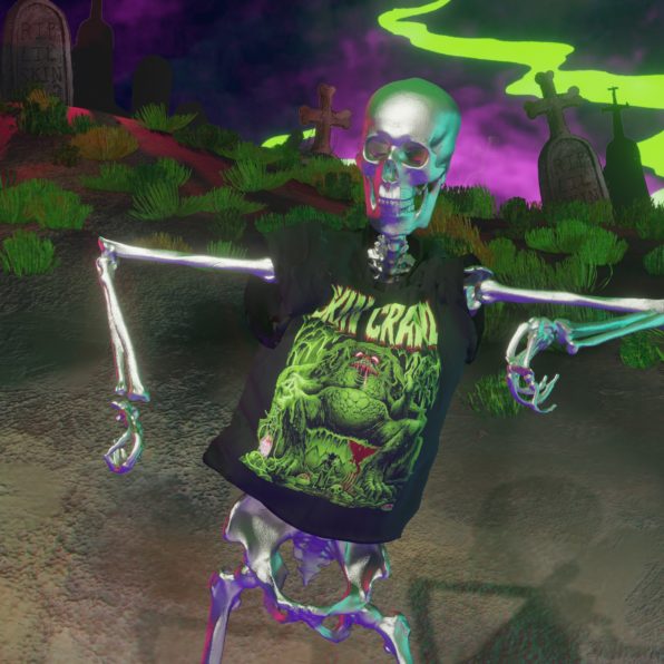
Are you a fan of Skin Crawl 2, the comic book series by Skinner? If you are, you’ll love these two tshirt video ads we made in Blender 3.5. Featuring the Morbs character and Tsathoggua, the giant toad god, these ads will make your skin crawl with excitement. Join us as we take a closer look at these creepy and cool t-shirts.

The first tshirt features Morbs, the mischievous and mysterious character from Skin Crawl 2. In the ad, a skeleton dances with style as it wears the Morbs tshirt. The dancing skeleton, combined with the eerie audio track, creates a perfect atmosphere for fans of horror and dark humor. The voiceover was done by me, reading Skinner’s own text, and the music and sound effects were created by me as well, with Skinner’s direction.

Skin Crawl – ‘Morbs’ T-shirt ad

The second tshirt ad features Tsathoggua, the giant toad god who has a prominent role in one of the Skin Crawl 2 stories. Tsathoggua is depicted in all his glory on the t-shirt, and the skeleton dancer in this ad pays tribute to this fearsome deity. Again, the voiceover, music, and sound effects were created by me with Skinner’s direction, and the visuals were made using Blender 3.5.

Skin Crawl ‘Tsathoggua’ – Tshirt Ad

In conclusion, if you’re a fan of Skin Crawl 2 and love tshirts with a creepy vibe, these ads are perfect for you. With their eye-catching visuals and creepy audio, they’re sure to grab people’s attention. Plus, they’re high-quality and made with top-notch animation software. They feature Morbs and Tsathoggua, two of the most popular characters from the series. We hope you enjoy watching them as much as we enjoyed making them. Get your Skin Crawl Tshirt today and join the dance of the skeletons!
You can order these T-shirts here:
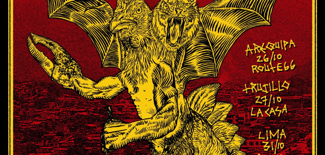
Metamorphosis Mini-Tour Mounstraso 2018

The final graphic.

Metamorphosis asked me to do a tour graphic for a t-shirt. They asked for it to be a graphic that could be screen printed in two color.

I had talked with them a little bit about the graphic ideas. Possibly a tiger chicken bat idea, but they asked for a crab hand in there too. Here’s my process:

I started out with this collage as a sort of sketch for the graphic.

The next step was to print it out in cyan (or any color that could later be removed) to go over it with india ink.

This was my initial ink, when I saw it the next day I wasn’t that happy with it but I went with it anyways.

This was the first rendition of the tour graphic. I submitted it to the band as a preview but I told them it was okay but could be better. I thought of using some Peruvian landscape in the background printed as halftone dots, this one was too muddy as well. The band wanted me to use the logo I had previously drawn for them too, and hand-done text. We also talked about a different color scheme.

The next step was to print it out in two sheets to get higher detail.

Printing it bigger allowed me to trace it in India ink with higher detail.
Cyan removed and line art cleaned up!

This is where the tour graphic initially went, I drew the text by hand, I think this was what the band asked for. The final rendition was simplified a little bit from this, without the reflected text and the additional lines on the top part.

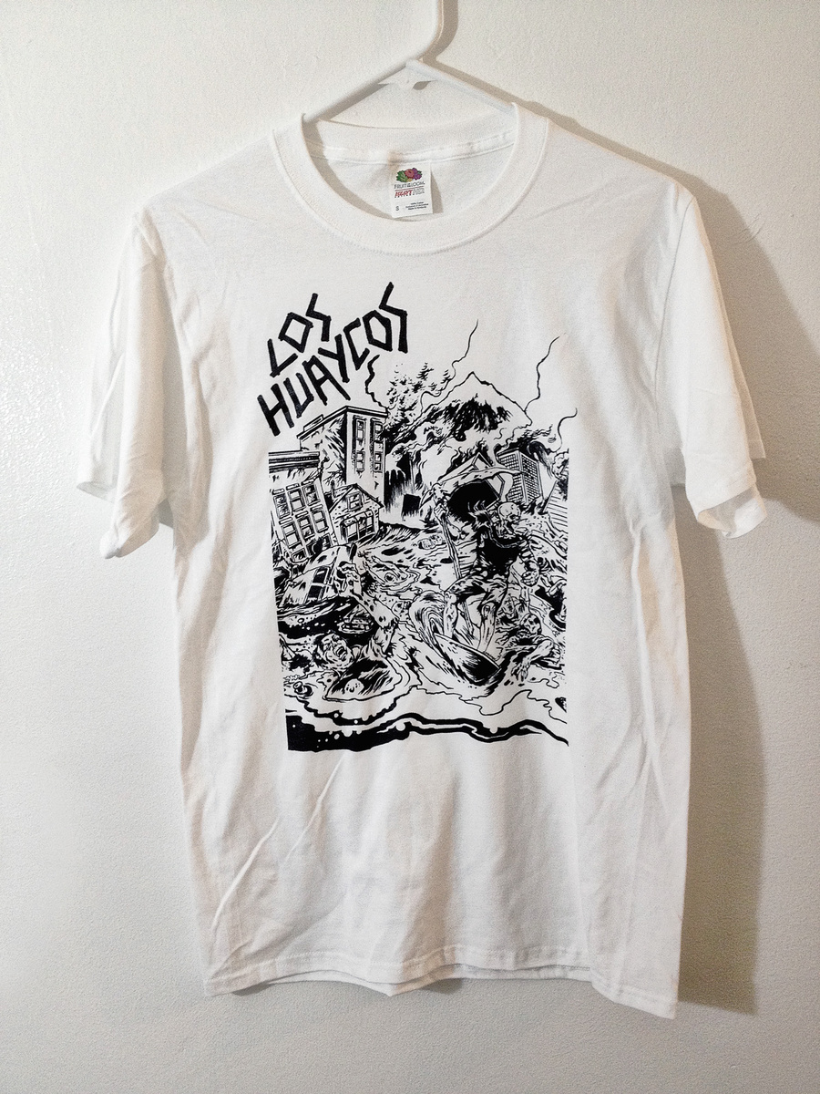
Los Huaycos — T-shirt for sale

loshuaycos-tshirt


These T-shirts are for sale at the Los Huaycos Band Camp:

loshuaycos.bandcamp.com/merch/landslide-t-shirt

Illustration by Andrei Bouzikov logo by me. The design went in several directions being directed by the whole band I had to quickly try out several different logo options and placements. We experimented with the title and different colors too. Renzo Gianella, Garzo and Ryan Brundage all pitched in with art direction until we had something everyone could agree on. We are all happy with how these came out and can’t wait to come up with more merch for the band!

New cover for Short Fast and Loud and new…

cover-photo1

This is for the upcoming Short Fast and Loud magazine. I’m working on the rest of the layout right now, it should be done shortly and off to press in the next couple weeks. I treated the photo with a custom bitmap line mesh.


front_cover

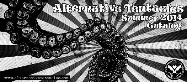
I also used a custom line mesh for the tentacle here. This is the cover for the upcoming Alternative Tentacles catalog. This should also be finished up in the next few days.